Imagine paying for a major home renovation and the workers only repaint one wall and move a picture. Sounds absurd? This is precisely the scandal that has erupted in the United Kingdom, where the government spent a colossal sum on a seemingly insignificant redesign of the GOV.UK website. This story is a vivid example of how government spending can trigger a storm of public outrage and call into question the wisdom of decisions made by those in power.
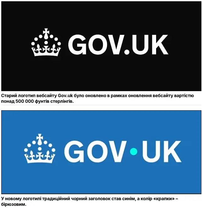
So, what exactly changed? The old, familiar logo with its black text on a white background is a thing of the past. It was replaced by a new design: the background is now blue, and the text is white. But the main "innovation," which became the subject of ridicule, was changing the color of the dot after the word "GOV." It is now turquoise. Yes, you understood correctly. A change in the background color and a single dot became the centerpiece of an update that cost British taxpayers a staggering £532,000.
This, to put it mildly, modest logo redesign was the result of a contract with a well-known advertising agency. According to the official version, these funds were part of a larger strategy to "refresh and expand the GOV.UK brand" across various platforms. The government tried to explain that this was not just a picture change, but a comprehensive effort aimed at unifying the style across all state digital resources. However, these explanations satisfied neither the public nor political opponents.
Criticism poured in from all sides. Representatives of an opposition party called the expenditure a "joke at the taxpayer's expense," stressing that in times of economic hardship, such sums could have been directed to much more important needs. Even civil servants, in private conversations, called the new logo "cheap," "tacky," and "tasteless." Social media exploded with memes, with users offering their own, no less "creative" redesign options for significantly less money.
This situation exposed a deep chasm between the bureaucratic vision of a "brand refresh" and its actual perception by society. For officials, it was a planned GOV.UK redesign, but for ordinary citizens, it was pure wastefulness. The story of the turquoise dot will forever go down in history as an example of how out of touch government projects can be. So, was this scandal inevitable? When it comes to such an incredible cost for minimal changes, the answer seems obvious. This is not just an update; it is an expensive lesson that the trust of the people cannot be bought, especially when their money is spent so recklessly.


